As part of the "Studio Redaktionelles Gestalten" seminar led by Samson Kirschning, Julia Reinbold, Lotte Frank and I were tasked with creating a visual identity for traces including designing a logo, the facade for "Forschungsstation" and a website.
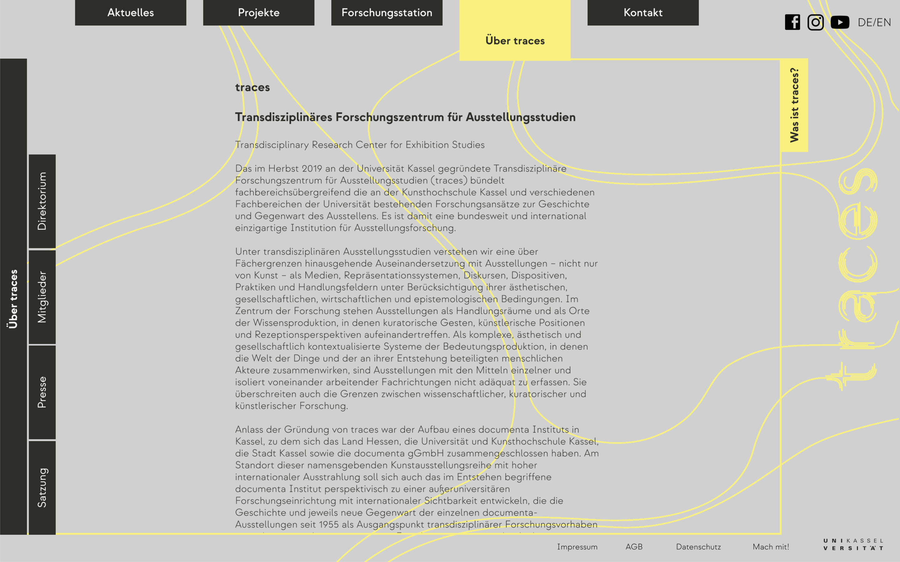
The Transdisciplinary Research Center for Exhibition Studies (TRACES), founded in autumn 2019 at the University of Kassel, was created to combine and enhance the research approaches to the past and present of exhibitions that exist at the Art School (Kunsthochschule Kassel) and the various departments of the university. It is therefore a unique institution for exhibition research, both in Germany and internationally. (Text from www.traces-ausstellungsstudien.de)
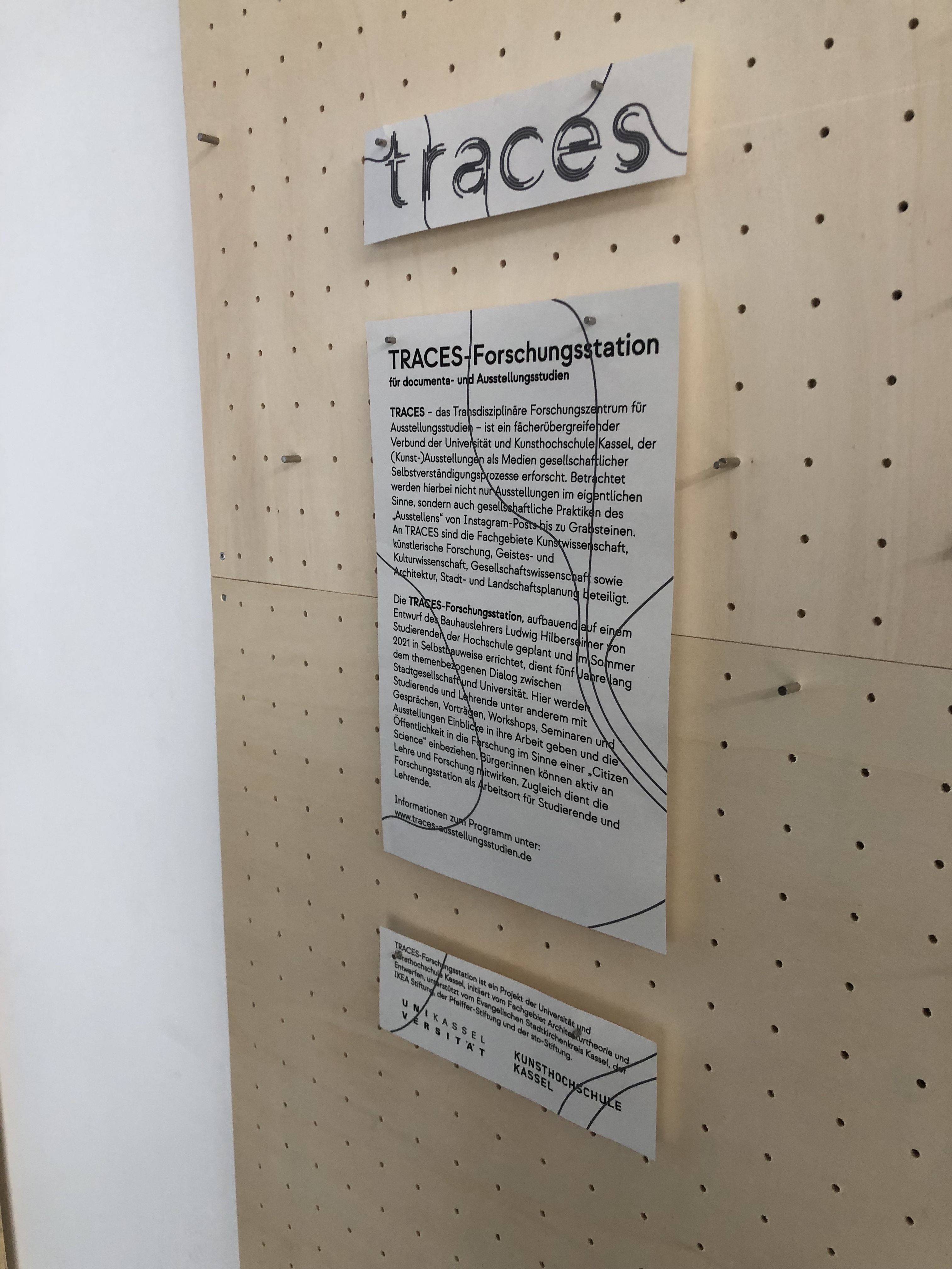
Based on the font Strawford we designed the logo of traces consisting of multiple lines. Inspired by lines of a movementanalysis each line represents a person wandering through the exhibition. Meeting others on their way, walking with them for a while before splitting up again. By themself these lines don't show much and only together the form the lettering "traces".
Forschungsstation
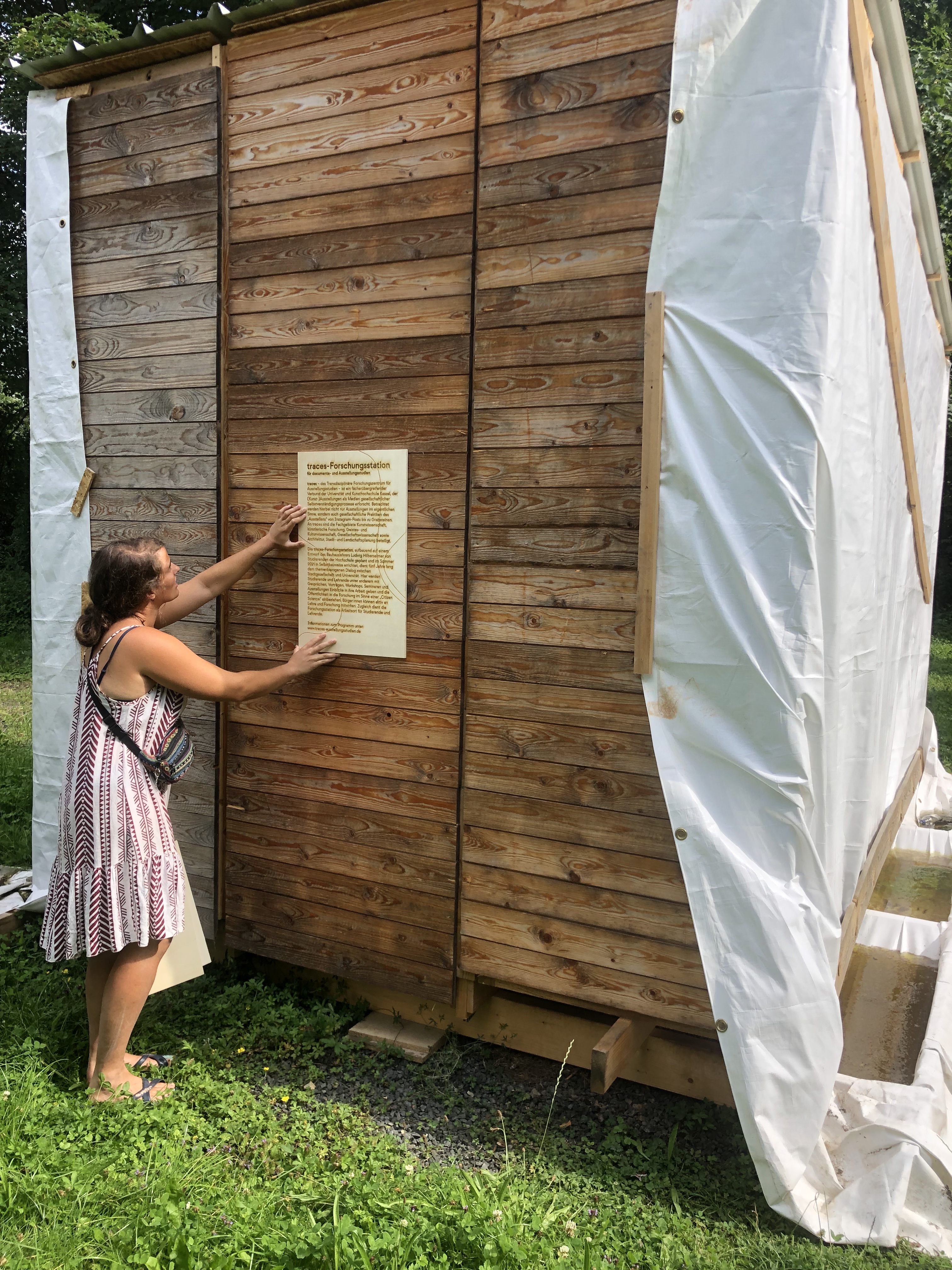
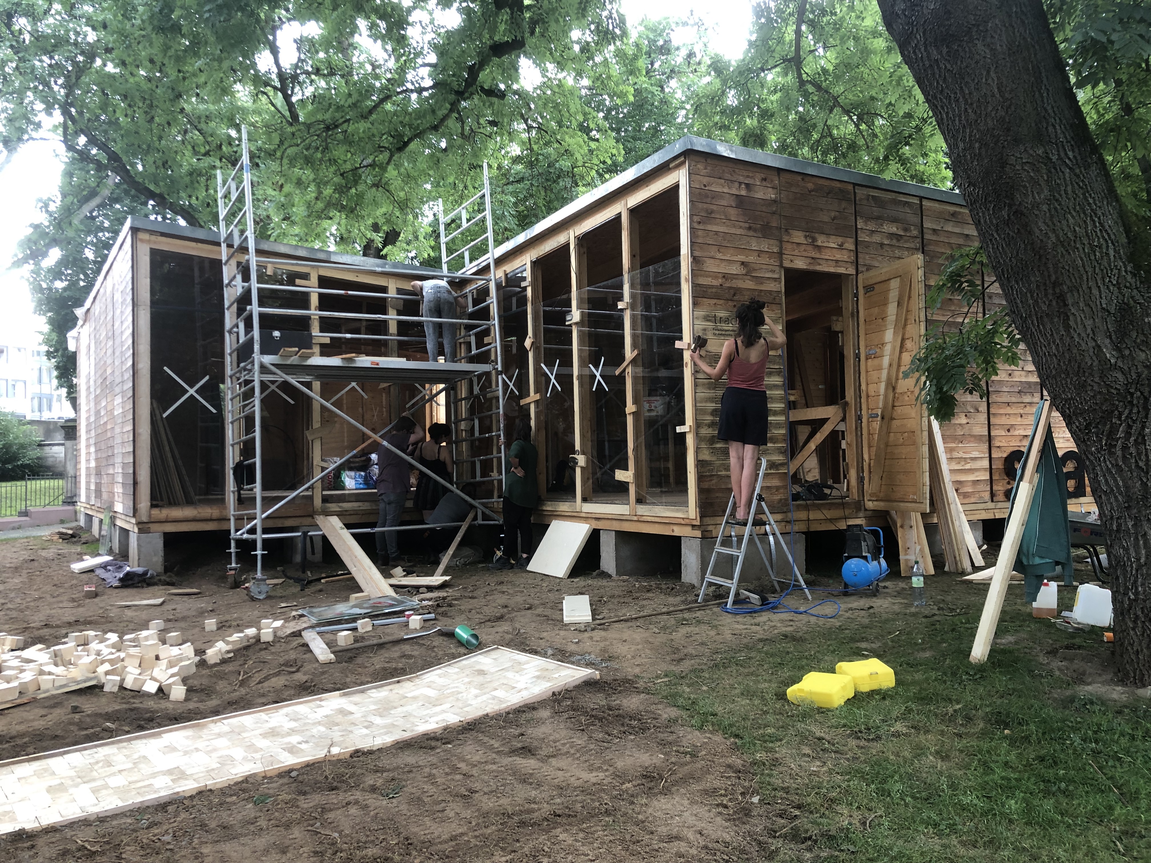
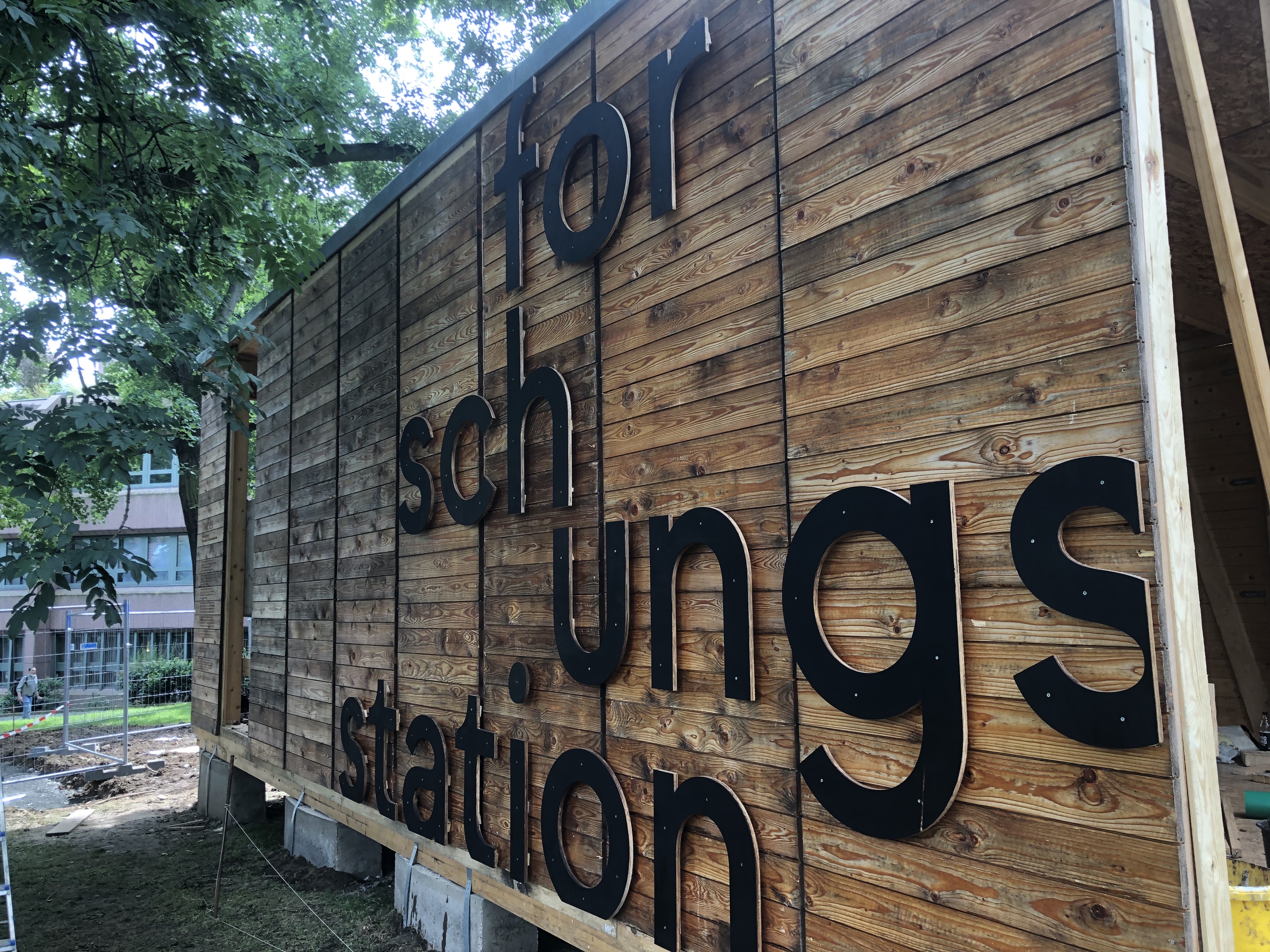
In a second step we were asked do design the facade of their "Forschungsstation". Located on Lutherplatz in downtown Kassel, covering around 100 square meters, it is facilitating the diaolgoue between urban society and the university. Here, students and teachers will provide insights into their work with talks, lectures, workshops, seminars and exhibitions and involve the public in research in the sense of "Citizen Science". The traces research station was built as a design-build project by students of architecture, landscape architecture, product design and visual communication under the direction of the Department of Architectural Theory and Design at the University of Kassel.
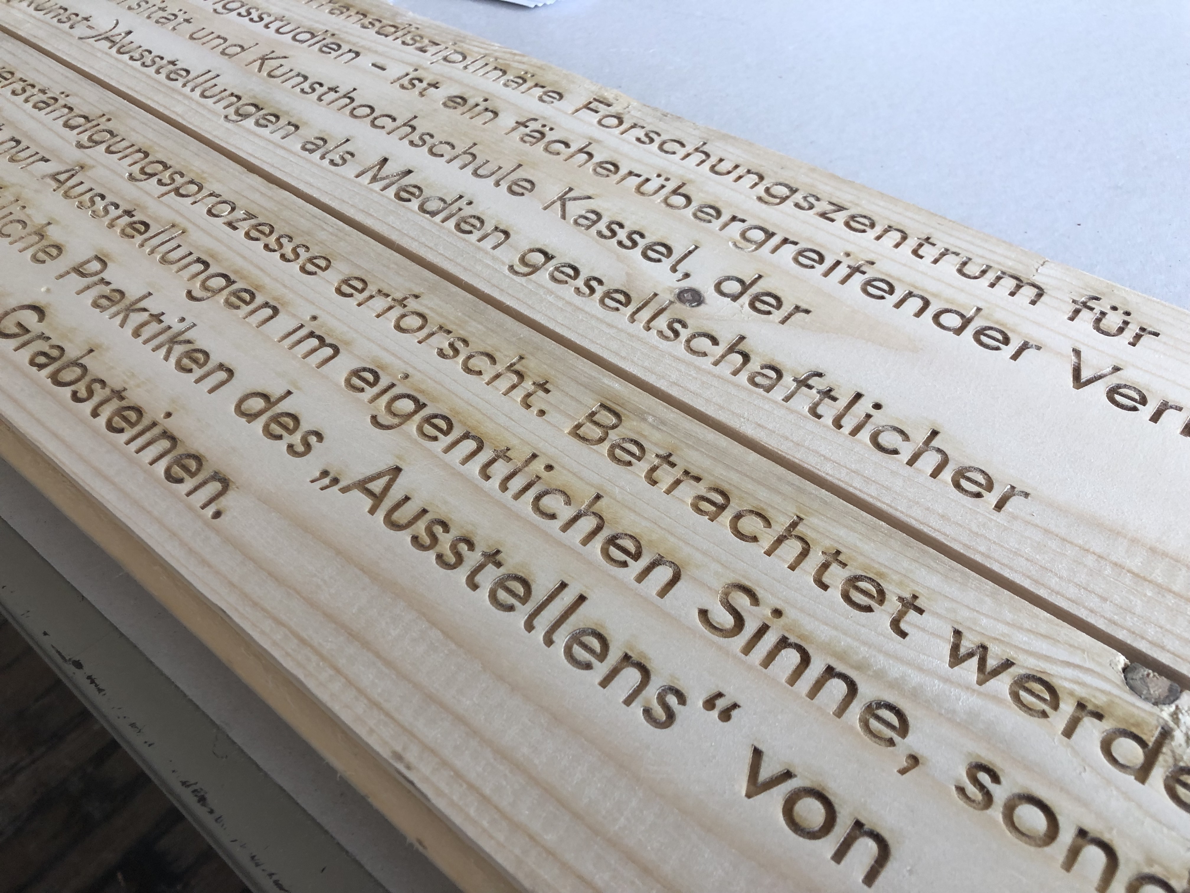
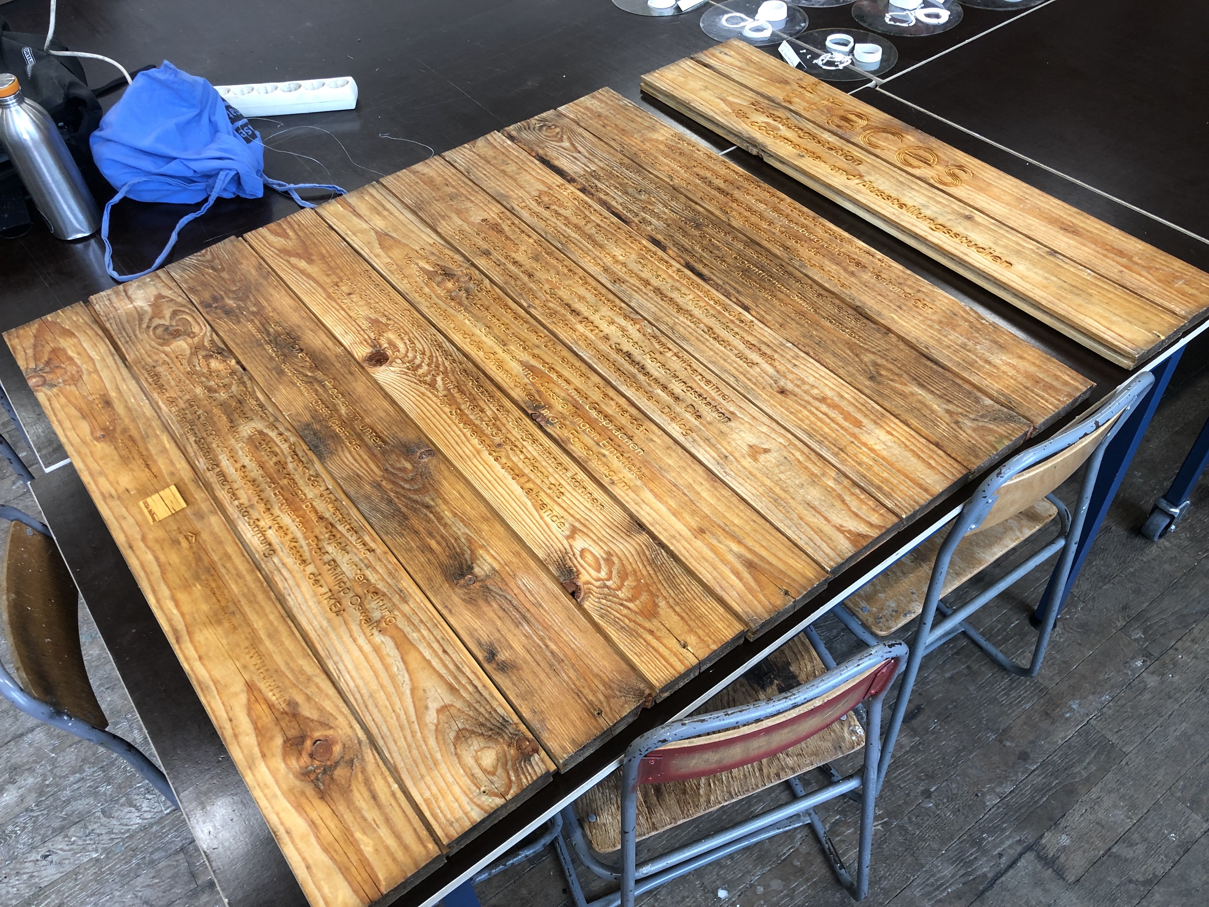
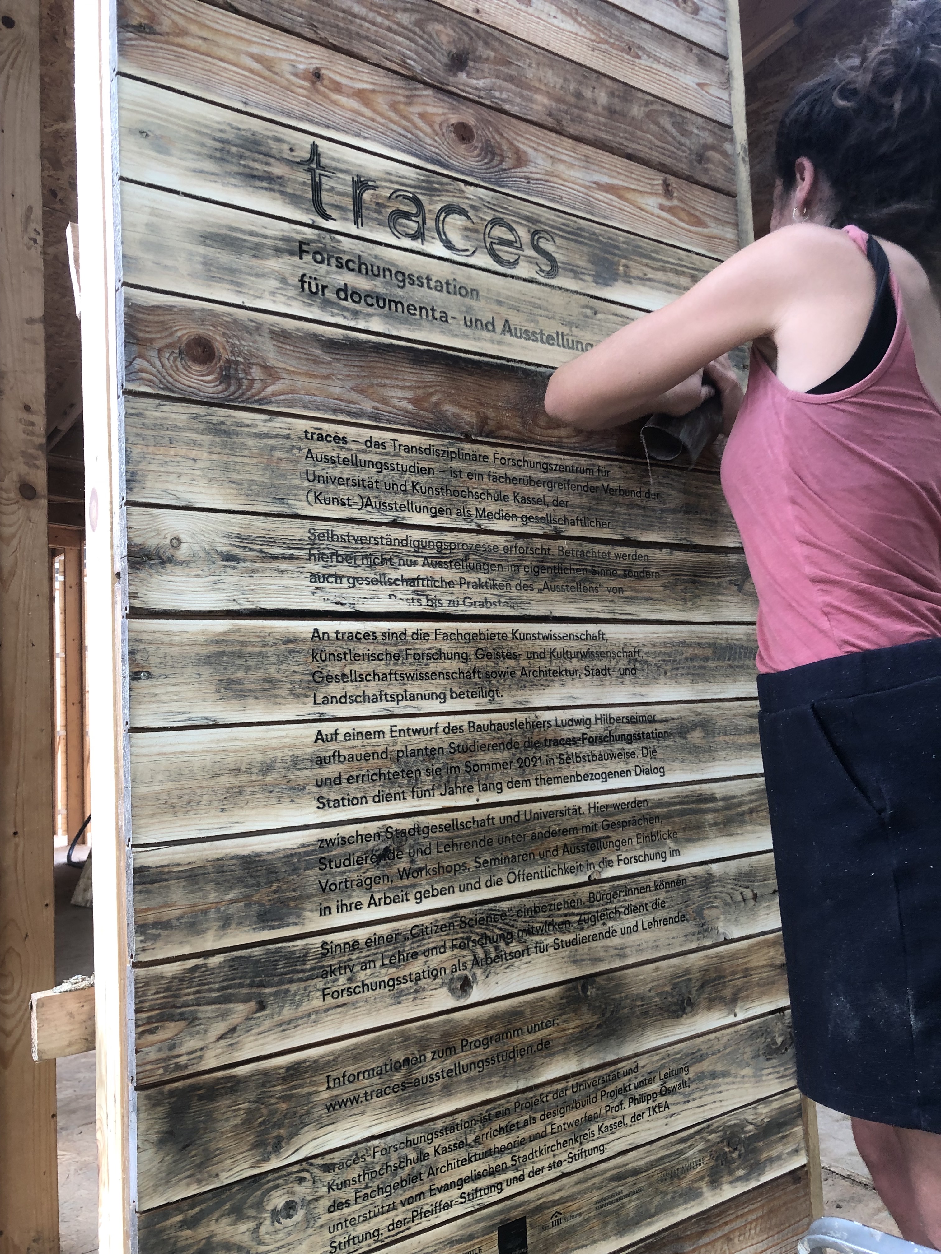
We originally planned on installing a sign outside of the research station, to display the text introducing it and it's purpose. However the architects did not like that idea and so we were able to convince them to let us laser the text into the facade itself. We tested the look on completely new pieces of wood and everything looked great. But for the final product we were suprised to get panels that were already oiled and weathered and so the text didn't really burn into the wood, making it very hard to read.
To make the text more legible we tried to spray-paint it. Using paint solvent we then tried to remove the paint from the surface, leaving only the paint inside the burnt in text. However that did not work all to well and so we had to sand the wood down, to the point where the paint had no longer soaked into the wood. After that we had to oil it once again. This whole procedure made the text at least somewhat more legible.
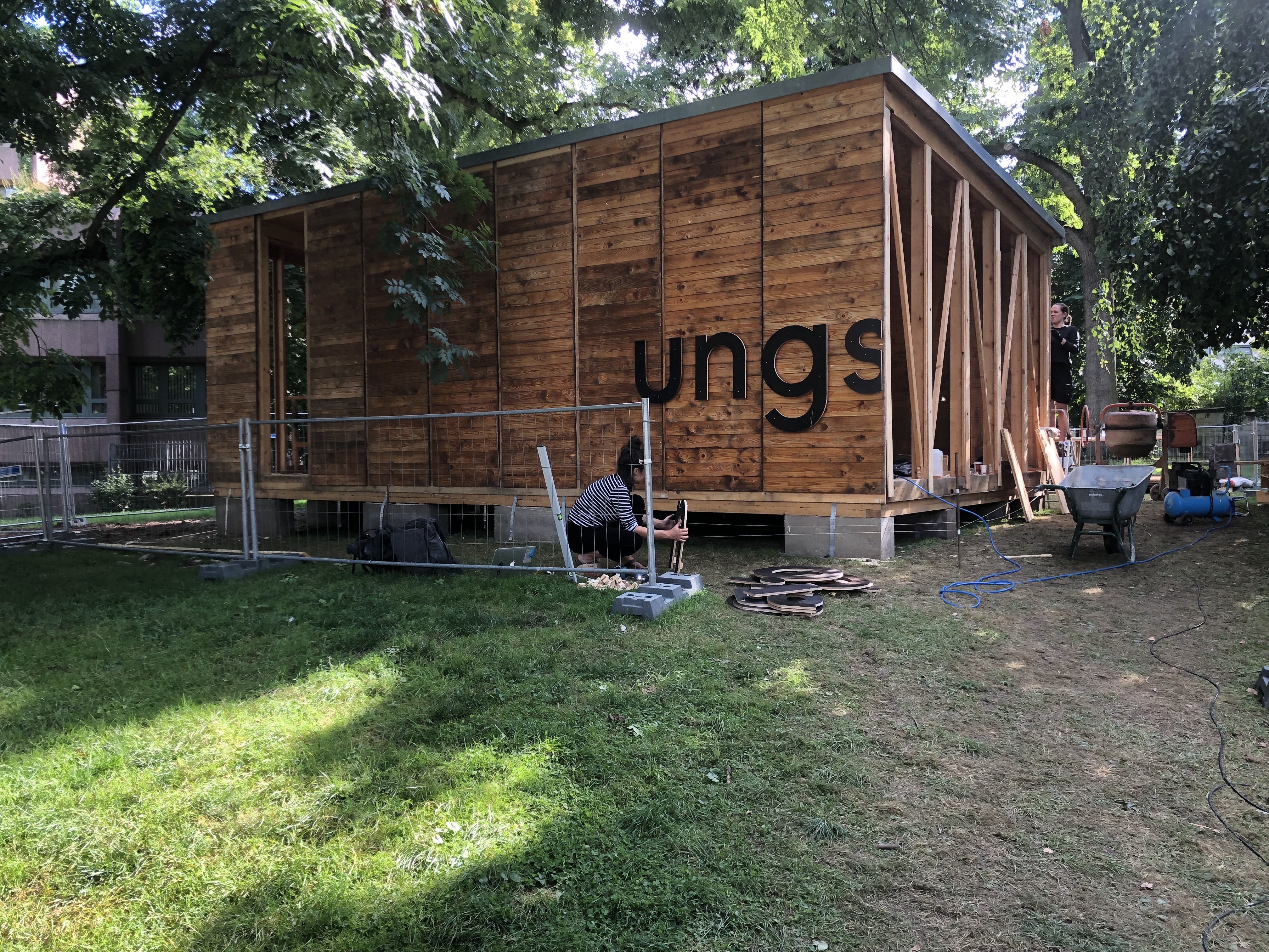
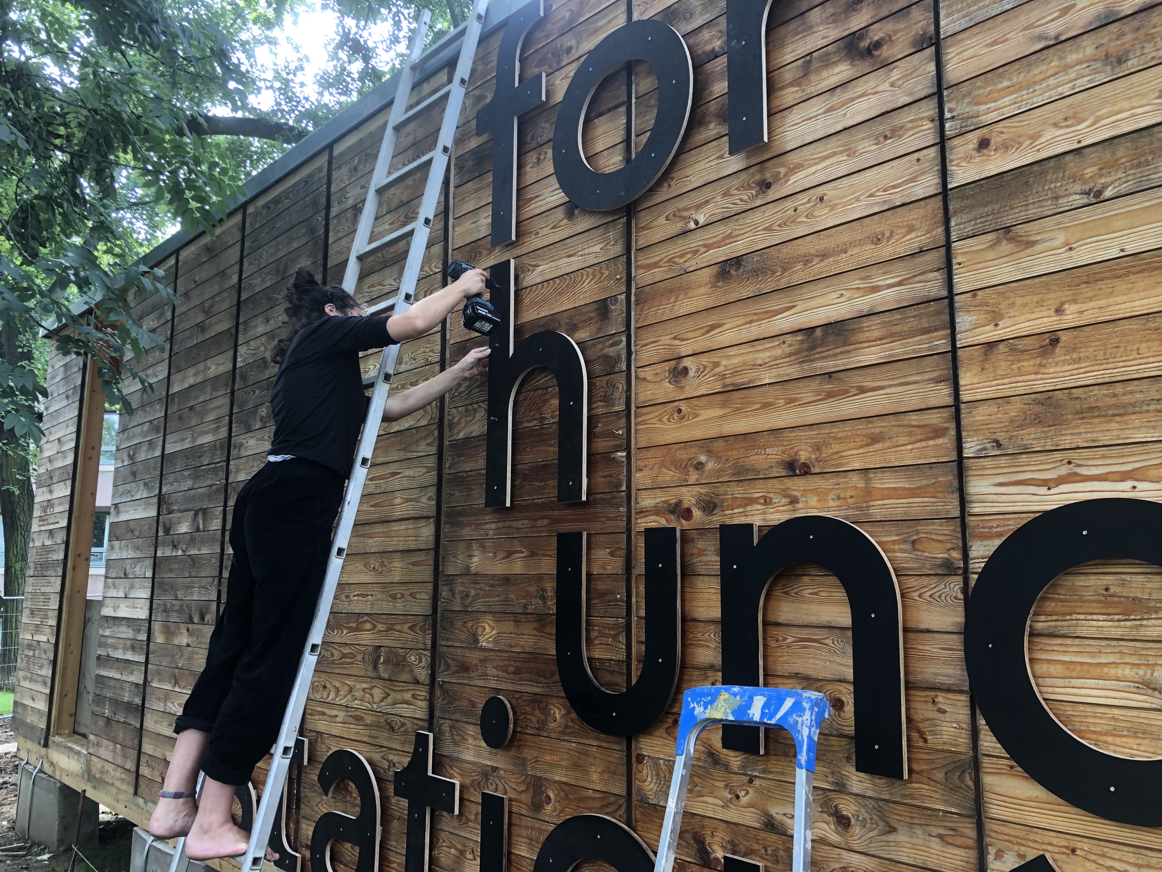
Next to the introductary Text we also wanted to display the the name "Forschungsstation". Initally we thought about printing it on pltter film but then we desided to mill the letters out of previously scorched wood and screw them onto the facade.
Website
As a third step we were tasked with designing the website for traces. The design is inspired by the archival heritages of traces and reminiscent of index cards. The interface invites the user the explore the website, opening one drawer after another. The design was then realized by Fabian Heller.